Thursday 18 October 2012

Illustrator and Photoshop work

   This is the image I created by using both Adobe illustrator and Adobe Photoshop  It is the image I created after completing the tutorial and have decided to use as the cover on my Graphics portfolio. The first few steps I did was to create a triangular and circular shape in illustrator, of which I changed by going to Objects>Blend>Make, then changed the spacing to 'specified steps'. I then moved it into Photoshop and started to manipulate it by layering colours onto the edge of it, and duplicating the layer four times, each with a different colour. I then sectioned my created image horizontally 8 times, reversed horizontally and motion blurred every other piece. The background I added was one I created from scratch, initially started out orange, but decided to add a lighter shade towards the center with added noise and motion ripple effect, this gave the background a 'heated' effect and allows the image to look pronounced against the background. 
   The first time I attempted the tutorial version, I found some of tools hard to use and some steps un-clear, so initially struggled to complete the task quickly. However after some time of playing around with the settings and a few times confirming my understanding of the step from either teacher, I completed the task. I then went on to create my own image and found the required steps easy, but also found the areas to decide on for myself interesting and creative. 
Monday 1 October 2012

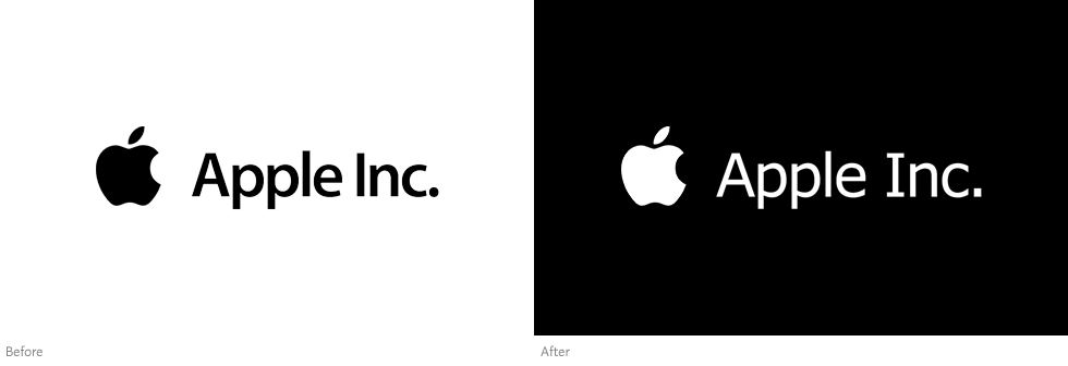
Apple inc. Typography

This is the 'Apple inc.' font, this is an evolution from the initial creation of Motter Tektura, created by Othmar Motter in Austria in 1975 to become the first Apple inc. font and logo design. At the time of its initial release, the font was considered modern and new. The changes that evolved started initially with the removal of the 'dot' over the lower-case i. Small changes were made to the physical appearance of the letters themselves over time after that. The most major changes since this original font was the removal of bold from the text and the letters have become completely san-serif, in some cases the font has included an uppercase i for Inc. rather than lowercase.

Michael Jackson - Dangerous

November 26, 1991 brought along Michael Jackson's album 'Dangerous'. The image on the cover of this album is one of the most intricate of any album cover, the creator, designer and artist of the masterpiece is Mark Ryden, a well known artist for more recent pieces. The image itself is very detailed, depicting royalty and great stature, superiority in class. The colours used dont often stray far from golds, royal blues or royal reds, these colours help maintain the decided projection power in the image. At the center of the image there is an increase in depth, this allows the viewer to eventually see past the probable falsity of the initial image.

Cream - Disraeli Gears

This 1967 'Disraeli Gears' album art by the band 'Cream' is almost a complete contrast to that of 'Pink Floyds' album 'Dark Side of the Moon'. Different in effects and types of visuals used, but equally as dramatic and interesting. This album rely's strongly on cartoonized psychedelic visuals for the attention of the audience. The multi-mix of colours, mid-tones and highlights almost attack from the center of the image, and resonate towards the edge. Finally the shadows around the base of the image create depth, a more 3D effect of the graphic, giving for better aesthetics and a more interesting field of view for the viewer of the piece. 

Pink Floyd - Dark Side of the Moon

This is the album cover from 'Pink Floyds' 8th studio album 'Dark Side of the Moon'. The image is initially simple, much black background shows no further detail other than that in the fore-ground. The foreground image is based on the principle of using a prism to refract light, into its' spectrum array of individual colours. The image is interesting for me as the cover evidently doesn't rely on big visual effects or many things within the image happening at once. The balance of the single white line against the multi-coloured spectrum contrasts well, and the almost illuminating center prism effortlessly combines this change.

Wednesday 19 September 2012

RHCP - Californication

This is the 1999 album cover 'Californication' by the band 'Red Hot Chilli Peppers' (RHCP). This cover art, for the album cover created on the 8th June of the same year by the Warner Bros. group, the actual designer/artist is unspecified. This image, for me is interesting through the reverse of the sky and water in the centre of the image. Even though the editing through the transgression between the sky and foliage isn't executed to perfection, the picture is very relaxing and simple to look at. The reversion of the two colours invoke a particular effect to the eyes and give a non-specified place of interest.    

Google - Typography

Google, created in January 1996 as a research project by Larry Page and Sergey Brin, both PhD students at at Stanford University in California. This font, created by Google has evolved from its origin in 1996, and become smoother and more visually appealing. The font itself is san-serif and is now a world-wide recognisable font and design. I like this font as it is not complex to look at, and is almost very visually inviting and appealing. The Google font was rated the 17th world-wide known font back in 2006.